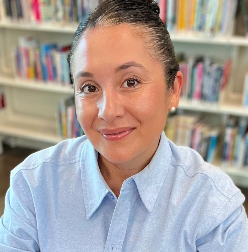
Data analyst · Mount Maunganui

GabrielaOlivera.

Gabriela Olivera

14 years in operations & procurement. Now building data systems end to end.

I know where operational numbers break before they ever reach a report. I turn messy real-world data into pipelines, models and decision-ready dashboards.

I learned the business before I learned the tools.

Data skills are only half the job

Before I worked in data, I spent 14 years working in operations and procurement. That taught me to question numbers before trusting them, understand how processes create data, and recognise when something looks technically correct but operationally wrong. Now I combine that judgement with SQL, Python, Power BI and modern data workflows.

Selected work

Real data · 3 projects
Terroir · Geospatial land-suitability analysis

Where should kiwifruit actually grow in the Bay of Plenty?

22,834Parcels analysed
16,072Scored
4Live sources

Four live New Zealand government datasets combined to score how well each rural parcel suits kiwifruit.
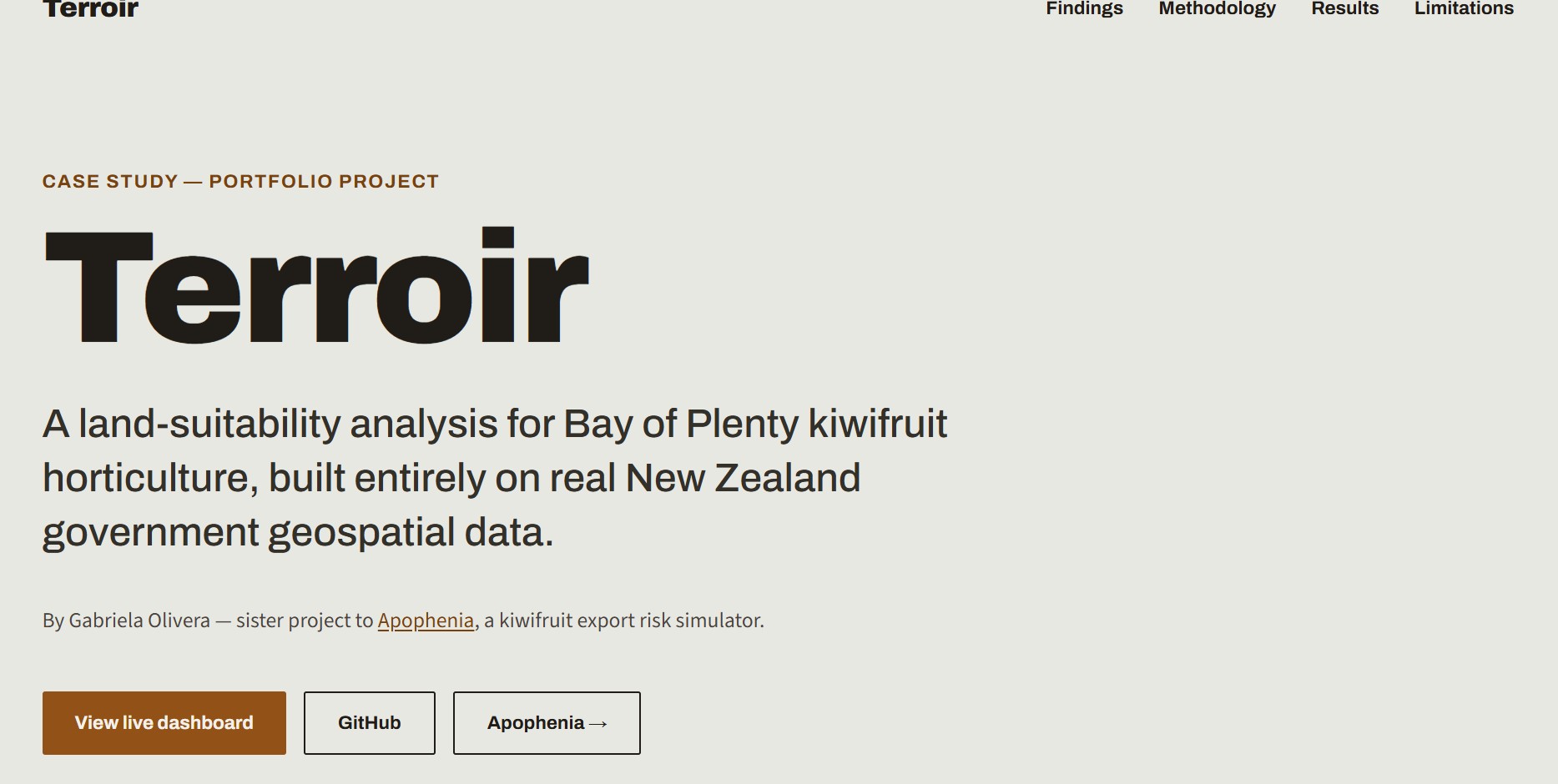
Screenshot of the Terroir Streamlit dashboard's suitability map, showing kiwifruit land-suitability parcels colour-coded across the Bay of Plenty coastline
LIVE DASHBOARD
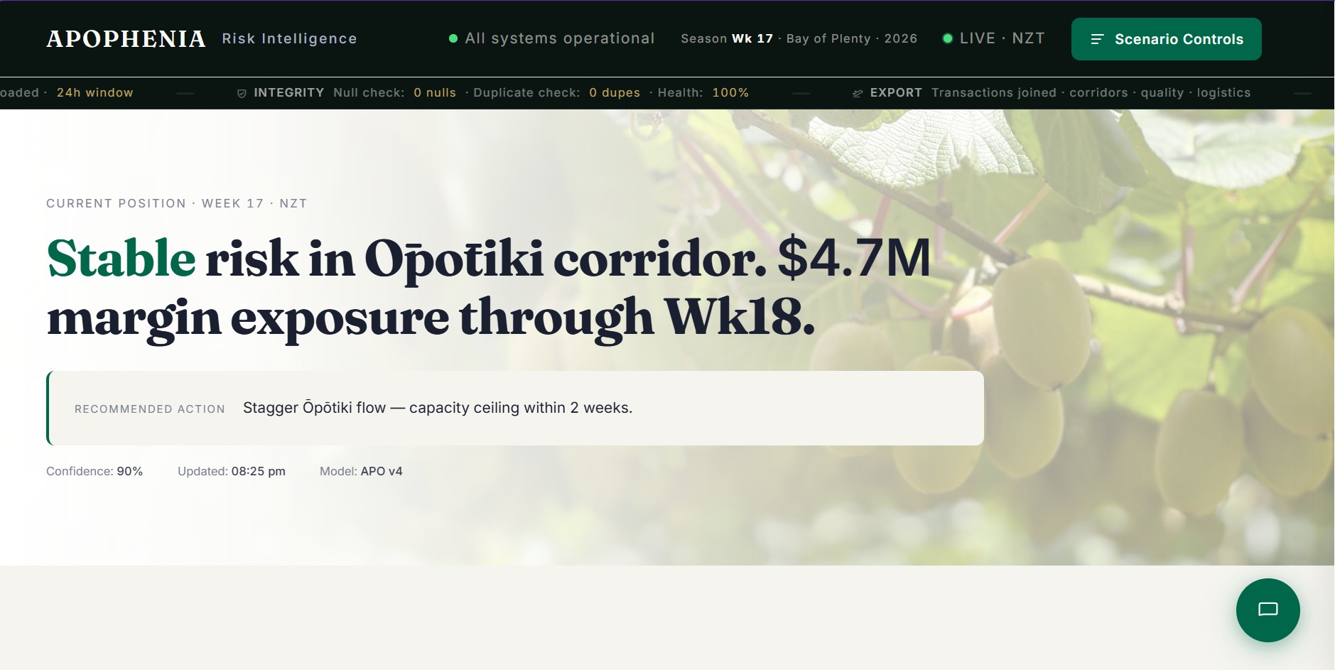
Apophenia · Operational risk simulator

What happens when an export season starts going wrong?

9Live variables
26wkForecast
4Data feeds

Weather, port congestion, fruit quality and regulatory load drive a simulator of risk, cost of delay and a 26-week forecast.

Screenshot of the Apophenia simulator interface, showing operational-risk sliders and forecast charts for a kiwifruit export season
LIVE DASHBOARD
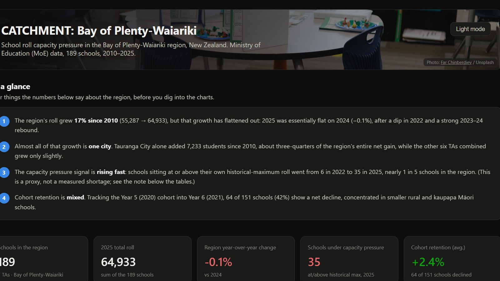
Catchment · NZ school rolls analysis

New Zealand schools, read through public data.

189Schools analysed
16Years of rolls
6Window-function analyses

Ministry of Education roll data for the Bay of Plenty-Waiariki region, modelled in a SQL star schema and analysed with window functions. An interactive dashboard tracks growth and capacity pressure; a Power BI report is planned next.

Screenshot of the Catchment dashboard, showing key takeaways, KPI tiles and a region-wide school roll trend chart for Bay of Plenty-Waiariki
DASHBOARD
How I work

From noise
to a decision.

01 · NOISE

Real data, not practice datasets

Both projects run on live government and public sources, with the real data-quality problems that come with them.

02 · PROCESSING

Limitations written down, not hidden

Every model states what it doesn't cover, so nobody mistakes a scope decision for an oversight.

03 · SIGNAL

Find the part that matters.

Analysis should reduce uncertainty, not just produce another chart.

04 · DECISION

Technical work, explained plainly

I write for the person who has to act on the analysis, not just the person who built it.

Data quality

I don't trust a number because a dashboard says it.

I trust it after I've asked where it came from, how it was transformed, what assumptions were made, and whether the result behaves the way reality says it should.

SourceWhere it came from
TransformationWhat was done to it
ValidationDoes it behave like reality?
ResultA number I can stand behind
The tools I useEvery day, on real data

Tools: SQL, Python, R, Power BI, Excel, Power Query, ETL, data quality checks, Git.

For small businesses

Straight answers from the numbers you already have.

You don't need a new system. You need someone who can look at your Xero data and your spreadsheets and tell you, plainly, what's going on.

See how I can help →Fixed price, confirmed in writing before any work starts.
SNAPSHOT REPORT · EXAMPLEHow is your business tracking this year?
SALES
MARGIN
CUSTOMERS
DELIVERY

Example dashboard with invented data. Yours is built around your own questions.

Let's talk about data.

Hiring

If you're looking for someone who can bridge operational reality and analytical work, I'd be happy to talk.

For your business

Want to know what your own numbers are telling you? Start with a fixed-price Snapshot Report.